Branding | Development | Marketing
Simfonia
BEAUTY ACADEMY
LOGO DESIGN
CATALOGUE
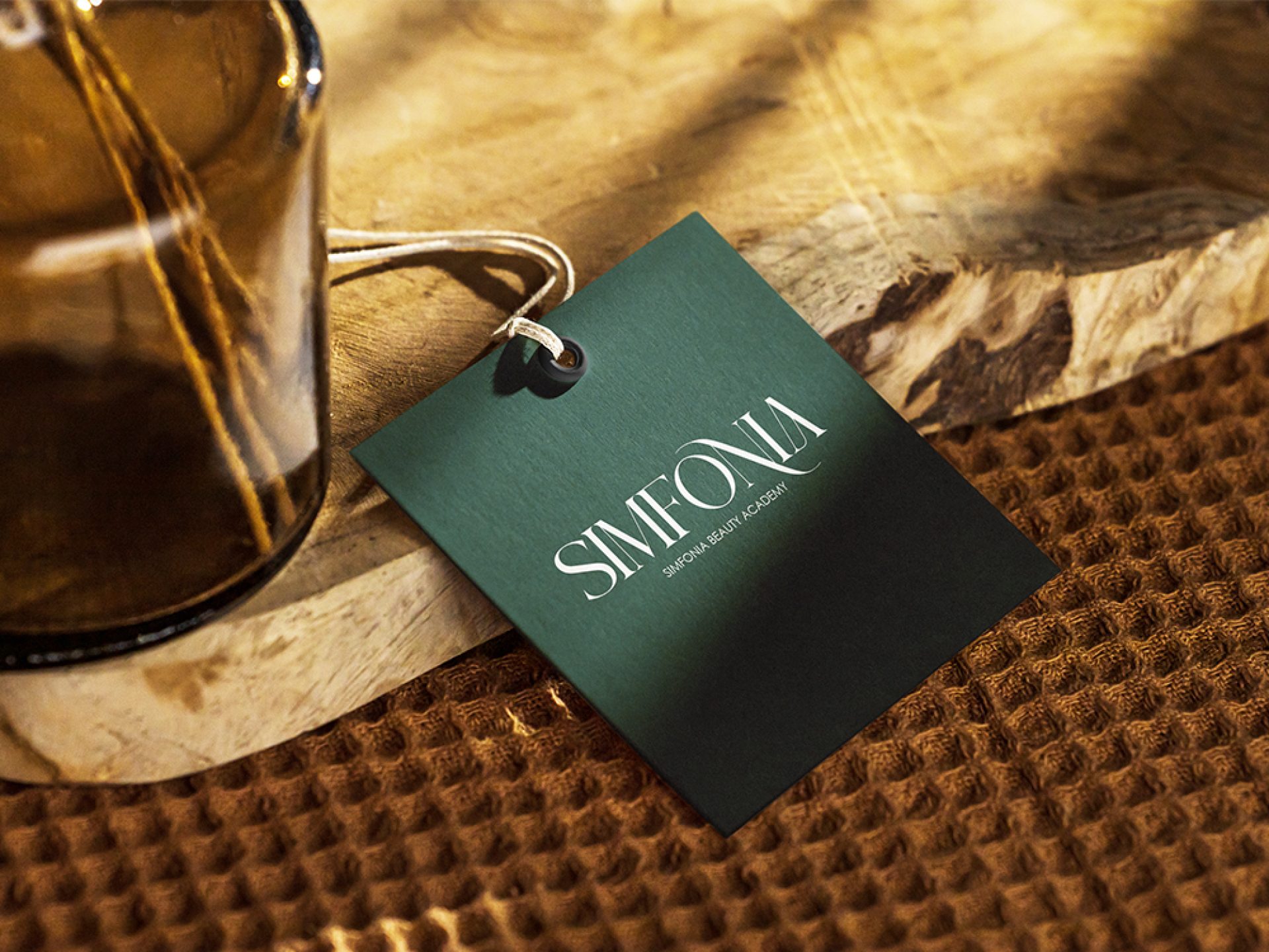
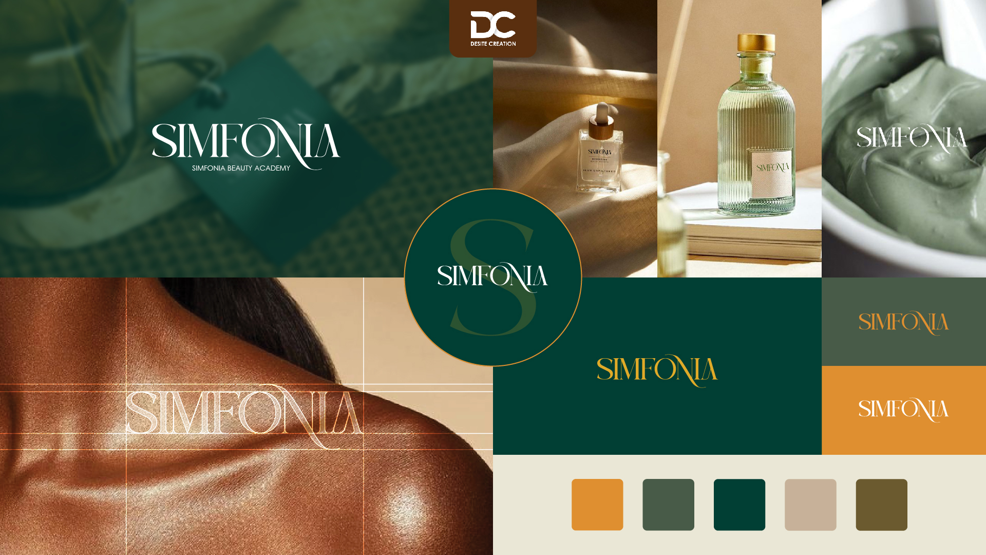
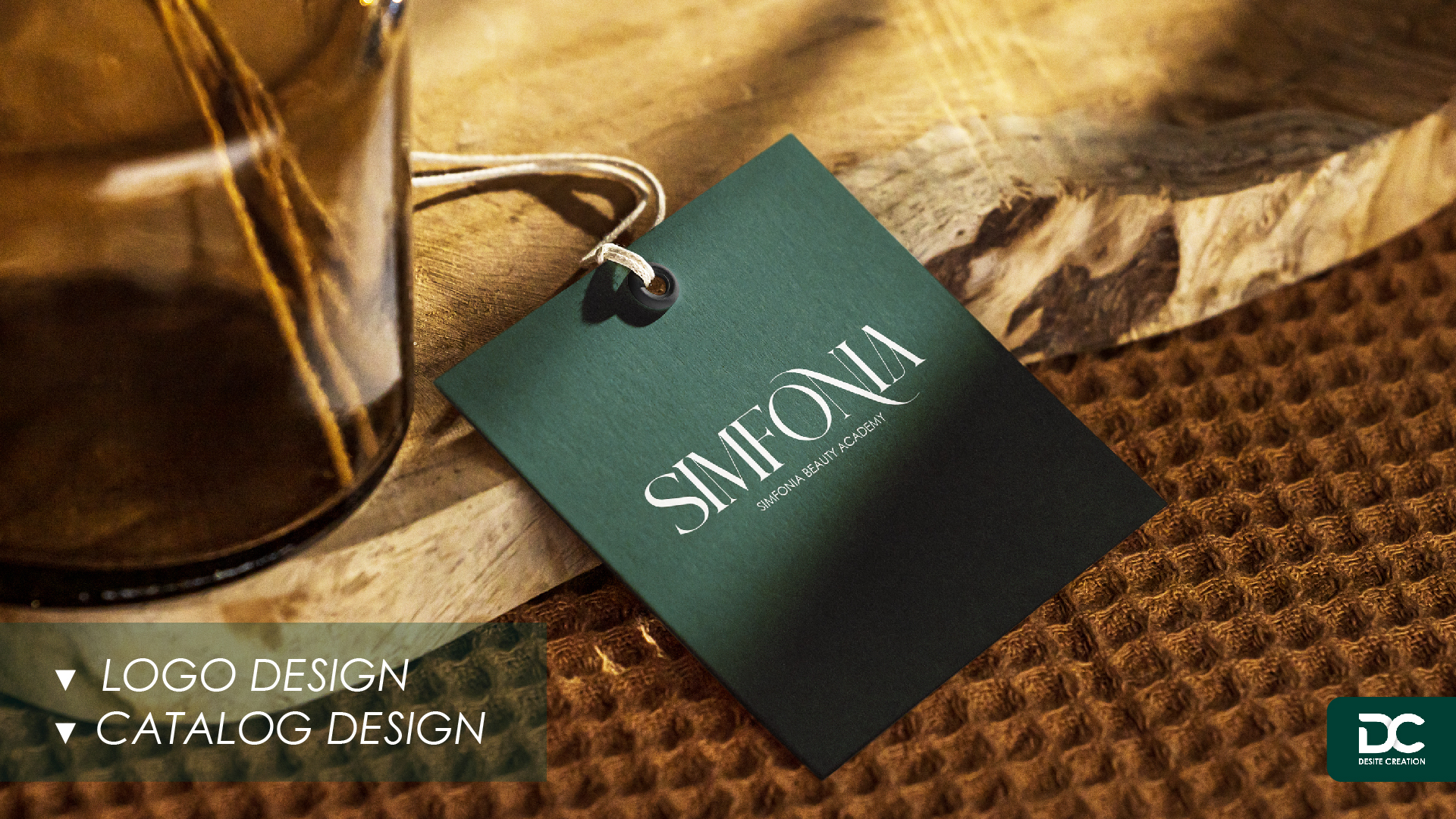
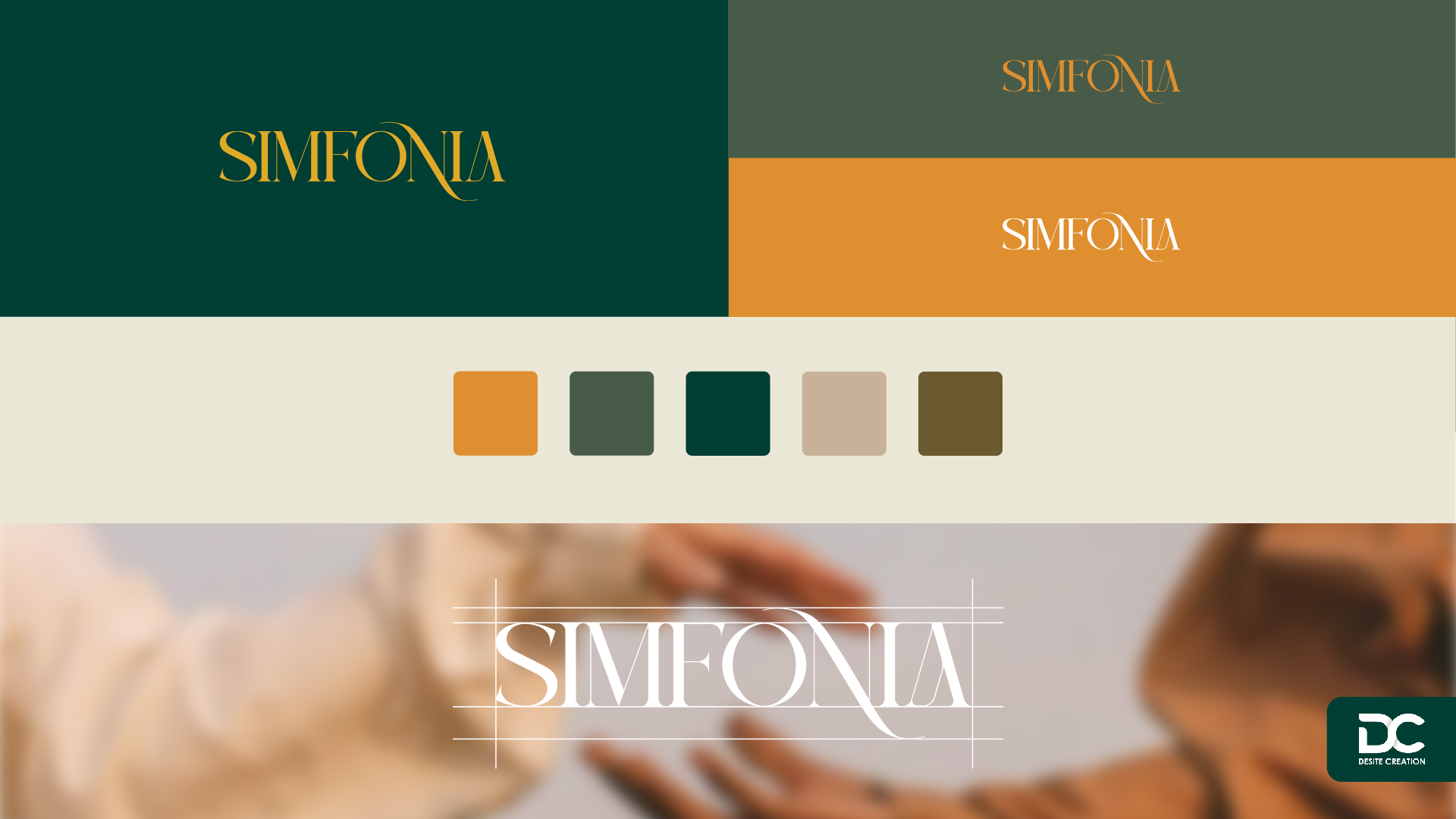
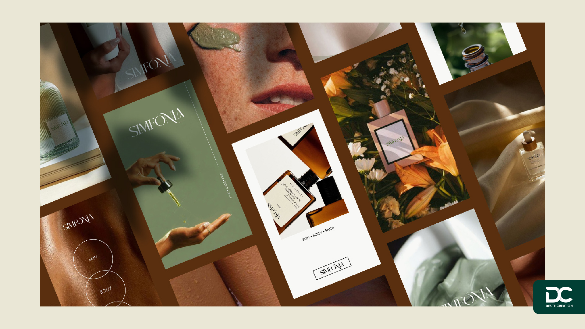
We designed a new logo for the well-known beauty academy, SIMFONIA, in the beauty industry. The smooth lines of the letter ‘N’ serve as the finishing touch to the entire design. The simplicity of the design ensures that the brand name, SIMFONIA, is easily remembered with just one glance. No excessive decorations or complexities—just a design that sticks in people’s minds at first sight.
SIMFONIA | Customize Catalog Design
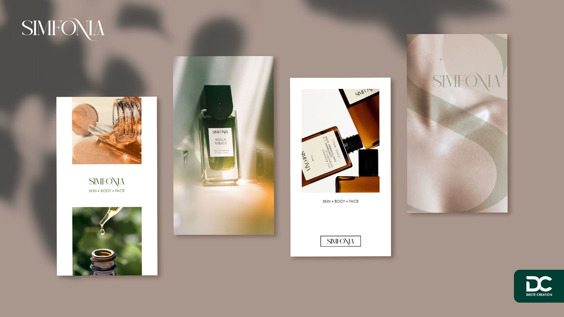
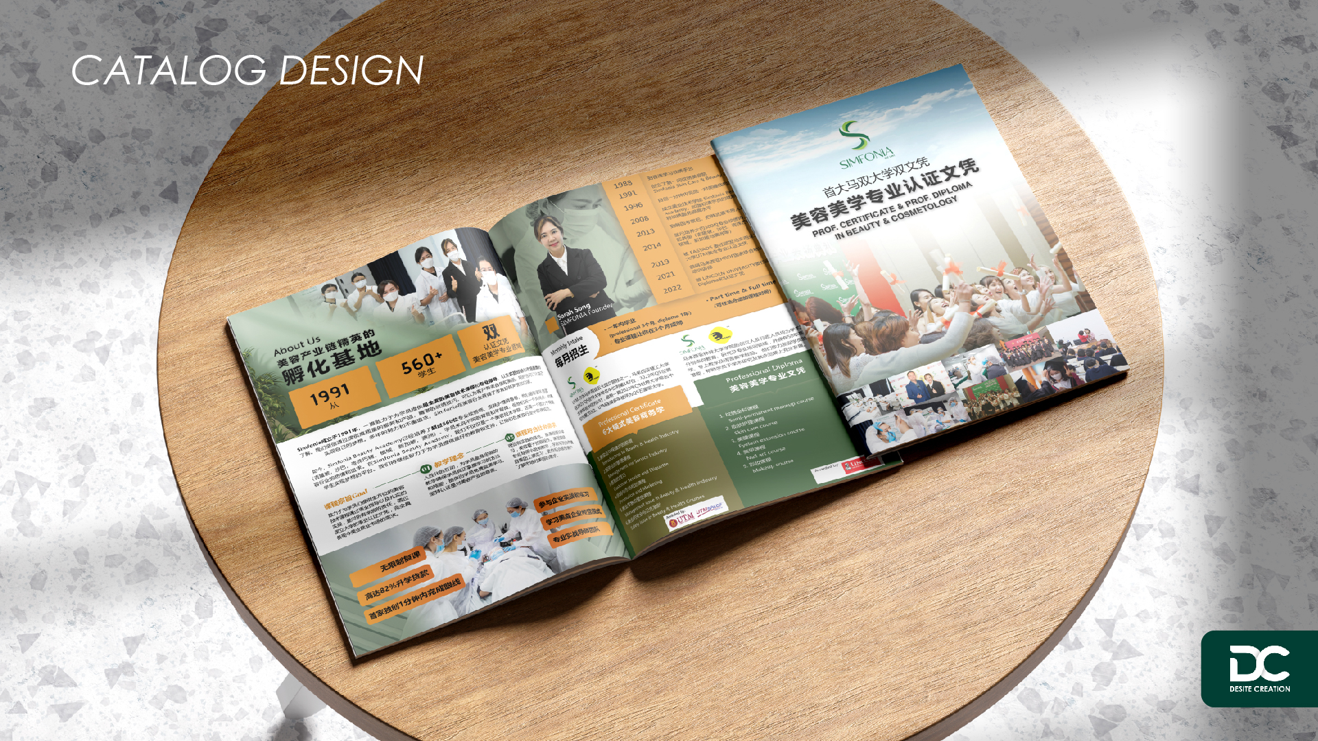
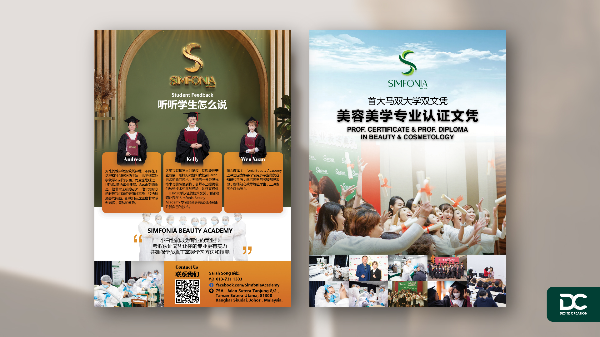
In this adventure of personalized design, we’ve meticulously crafted a catalog for SIMFONIA Beauty Academy, infusing it with the essence of beautiful design. Each page is a cleverly arranged canvas of information, presenting a unique yet harmonious whole. The primary colors, orange and turquoise, thread through the entire composition—orange brings vibrancy and warmth, while turquoise conveys a sense of professionalism and freshness. From the cover to the tiniest details, our understanding of SIMFONIA Beauty Academy runs deep, ensuring every reader can feel the beauty of the design while flipping through the pages. This isn’t just a catalog; it’s a journey of exploring the essence of design.

More Projects


